
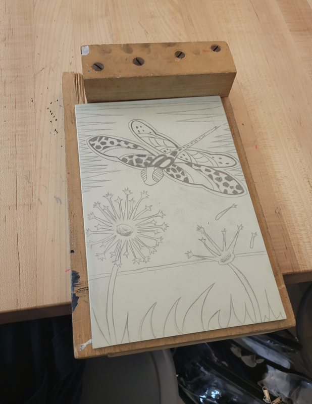
Title: Departure
Size: 23 x 15.25 cm
Medium: Ink on paper
Completion: October 2023
Exhibition
Departure is a water based ink block print that was made from carving a plastic board and printing a design onto paper. This project was out of my comfort zone because this was a medium I had learned about but never tried myself. Departure shows a single dragonfly that is strangely attracted to a dandelion. When a person sees this piece, I want them to wonder how this strange connection can have a deeper meaning.
Inspiration


Falcon by Rosalind Monks Laguna Cove by Paul Landacre
Rosalind Monks is a Swiss artist that likes to capture the beauty of nature around her by drawing intricate patterns on animals that she is inspired by, admiring the environment she surrounds herself with. The illustration on the left was created in pen and ink on a white paper. What draws me to her art are the fine patterns and designs within the animal she draws, because she works in black and white, the contrast of the illustration is clear. The viewer moves their eye within the animal because it has such detailed design, and because the white background brings a focus to the subject. I wanted to do something like that with my subject, create an animal with an interesting design that brings the attention to itself and makes the viewer's eye examine it because of the black and white contrast that is crowded in the subject.
I wanted to have more inspiration for my background contrary to Monk's use of white background, I wanted a more complete feel for my block print, and I found an artist named Paul Landacre. Paul Landacre was an American illustrator who created wood engravings during the 1920s. He caught my interest for his outstanding use of contrast within his work. Landacre worked on wood engravings that focus on detail in a landscape. He creates an impressive gradient in his work that immerses the viewer to admire and even question how that gradient effect was created. Although I knew that the same shading effect Landacre used could not be recreated on a block print, I wanted to recreate the lines in the sky that get smaller towards the bottom of the piece to still have an element of line from him.
I wanted to have more inspiration for my background contrary to Monk's use of white background, I wanted a more complete feel for my block print, and I found an artist named Paul Landacre. Paul Landacre was an American illustrator who created wood engravings during the 1920s. He caught my interest for his outstanding use of contrast within his work. Landacre worked on wood engravings that focus on detail in a landscape. He creates an impressive gradient in his work that immerses the viewer to admire and even question how that gradient effect was created. Although I knew that the same shading effect Landacre used could not be recreated on a block print, I wanted to recreate the lines in the sky that get smaller towards the bottom of the piece to still have an element of line from him.
Planning

|

|
We were given a 23 x 15.25 cm board that would be the only and final board we used to print out our design in class. Before sketching anything on the board itself, I made three sketches with different ideas that connect to the theme of my choice, and decided which one was the best. Before starting the actual sketches, I took the board and placed it over my sketchbook. I did my best to place it in the center and pressed down on it while I traced the edges. I did this for three separate pages, and I planned on creating a different complex image for each sketch. Instead of starting on one of my final sketches, I practiced some ideas I had on other pages to brainstorm my theme and subject.

One of my ideas was to draw a dragonfly and a dandelion, because the theme I want to focus on this piece is the departure of childhood, because it is very relevant at this point of my life. I chose my subject to be a dragonfly because it is a symbol of change which is happening all the time right before my eyes. Change, no matter what, has always been challenging for me to accept. I can remember a lot of times when there was a huge change in my life I chose to look back on the past instead of towards the future. For this reason I thought that the dragonfly symbolizing change, should be attracted to a dandelion, a plant that reminds me of the carefree past. Dandelions to me symbolize the past because they remind me of the pure joy and innocence I felt blowing their seeds away when I was younger.
These two contradicting ideas satisfied the goal of the artwork, and the next step was to draw out the anatomy of the dragonfly. I drew the anatomy of the dragonfly from above, to get a sense of how it should look from every angle. I thought that if I had an entire view of the dragonfly it would be easier to manipulate the perspective I chose to create, since I did not want to simply copy the image I had drawn onto my final idea. It would also make more sense for the angle to be changed so that the viewer can see that the dragonfly is attracted to the dandelion.
These two contradicting ideas satisfied the goal of the artwork, and the next step was to draw out the anatomy of the dragonfly. I drew the anatomy of the dragonfly from above, to get a sense of how it should look from every angle. I thought that if I had an entire view of the dragonfly it would be easier to manipulate the perspective I chose to create, since I did not want to simply copy the image I had drawn onto my final idea. It would also make more sense for the angle to be changed so that the viewer can see that the dragonfly is attracted to the dandelion.


|
Returning to my final drawing, I started out by drawing the dandelion itself, because that would give me the idea of where to place the dragonfly. I drew a dandelion with all of the seeds on the left and another losing its seeds on the right, symbolizing the departure of childhood. The most difficult part of this drawing was figuring out the perspective and size of the dragonfly. As I was drawing it in my final sketch, I erased it so many times because I would draw it too large, or too small, and in an awkward position. As I would draw it I would look back at my dragonfly anatomy drawing and it was not guiding me nearly as much as I thought it would, because I needed more references from different angles. However I continued to reference that one sketch and I drew the final dragonfly (above). Although the perspective is not perfect, I wanted the wings to be visible from that point of view and I drew them showing everything. Remembering how Rosalind Monks made patterns in her subjects, I did so with mine as well. The pattern is not nearly as detailed as Monk's because she draws her illustration with pen and ink, which is more definite than a carving tool. To incorporate the gradient element from Paul Landacre, the background has some white lines that progressively get smaller as they move towards the bottom of the drawing. Pleased with my idea, I lightly shaded in the sections that would remain black and moved on to transfering my drawing onto my board.
|
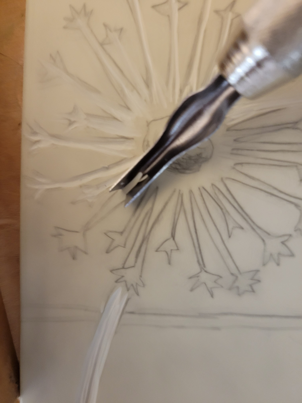
To transfer my drawing to my board, I took another sheet of paper and traced the board on top of it like I had done previously when I started to plan my drawing. I cut out the board-sized sheet of paper and shaded it all with pencil, leaving no white spots. I took the shaded sheet of paper and placed it below my final sketch, with the non-shaded parts of each paper facing each other. I took my board and aligned it as best I could to the part of the paper that was shaded. I pressed it down, and on my final sketch I traced it again, to transfer the image as accurately as possible onto the board, shading in what I thought was most important. When I finished tracing the image, I noticed that the pencil marks were very faint. So I took my pencil and instead of repeating the process again, I just made the lines darker on my actual board, since I could see them well enough to trace them accurately. Some details were hard to recreate, such as the fine lines at the tip of the dandelion, but it would be easier to carve out eventually. I added and took away certain details. I decided to remove some thin black lines that were in my original sketch because they were too minuscule to recreate. I added darker black lines to the back of the wings to make up for the removal of the erased lines. The shading of the background seemed unnecessary to me, because I knew that I would only carve out the triangle shapes in the background, and everything else would be inked.
|
Process
|

|
|
Once the board was ready to be carved, I placed it on a wooden board that would keep it still and firm to make the carving process easier. The carving tool I was using was provided in class has a handle and 5 different options to carve with. The narrower the tip, the more fine and detailed the carving was. There were some tips I didn't use, the widest one and the finest one. When I first began carving, I used the widest tip because I was beginning at the bottom of my board where the grass is. That area is much larger than the other sections so naturally I began with the widest one. However when I first used it, I used a lot of pressure on the board because it would not glide smoothly the way I thought it would, and it slipped. It almost messed up my foreground but fortunately it stayed within the outline.
I tried again, this time with less pressure and more control, but it was still stubborn and would not move until it slightly slipped again. This happened again and that's when I decided to change the tip to a narrower one. I used the one in the picture furthest to the right, and I used that one the most. It glided smoothly and was much easier to manipulate than the previous one. Once I got used to using a medium amount of pressure and gliding it comfortably across the board I began working at a quicker pace. I carved decent amounts of the board at a time, and made them adequately narrow to prevent the ink from covering it up. I worked from bottom to the top to make sure I had enough experience with the process before carving out the dragonfly. Surprisingly, the carving of the dandelion was not difficult. The tip I was using was the perfect size to accurately carve out the shape of it. The dragonfly was more challenging, since I was afraid that I would make a mistake, and I spent more time on it than any other part of the board. This was when I wanted to use the finest (not flat) tip that I had. Unfortunately I had a similar experience with the fine tip as with the wide tip. It was tough to manipulate and would slip all the time, which was unfortunate because I planned to use it on the smallest sections of the dragonfly. I resorted to using the other tip I had used before, which still had a good result. However I improvised on the design since the details were hard to manage. Instead of having the back wings be white with black circles, I tried my best to carve out those circles while the wings remained black. My last step was to carve out the background triangles, and it was like carving out the foreground. It was quick, and to be safe I made all the earlier carvings narrower as well.

|

|
My next step was to start inking. The materials that were provided were water-based ink, a roller, a metal tray, a plastic palette knife, and a baren. To begin this process I used the palette knife to scoop up some water-based ink and place it on the metal tray. I then spread the ink out evenly to the best of my ability with the roller. I rolled it for a short amount of time on the tray to make sure that the ink was evenly spread on the roller, to not have any blotchy spots that overpowered one side of it. This was to ensure the final product did not look incomplete. When I was sure I had enough ink, I rolled it onto my actual board. I rolled it quickly, making sure to cover the entire thing. I washed my hands before actually grabbing the inked board to be certain that I wouldn't accidentally mark the paper with ink from my fingers. I picked up the board and tried to match it in the center. I then laid it down and took the ink presser, and pressed it all over the board. I rubbed the presser in all spots before peeling the board back off to reveal the final result.
Experimentation

This was my first block print. After I removed the board from the paper I was immediately disappointed with how scarce the ink was. The ink did not take long to dry and once it did I began annotating my mistakes to do better on my next print. There was obviously an unevenness and lack of ink throughout the whole print that makes it look incomplete. Though most of my carving was successful, I was surprised to see that there were small sections meant to be white that had ink on them. I took note of that and I planned to carve deeper into that specific region. The dandelion also needed to be refined to have the clean look I wanted to have.
As I stepped away from the paper to see the bigger issues, I noticed that the dragonfly looked unfinished, because towards the back, the body was separated in fragments. I realized that I completely missed the outline of the body, most likely because the original image was engraved in my brain at this point, and I had to look closer to notice mistakes. My last critique of this print was that the image should be more centered as it was tilting towards the right. I repeated the inking process with these mistakes in mind to improve the block print.
As I stepped away from the paper to see the bigger issues, I noticed that the dragonfly looked unfinished, because towards the back, the body was separated in fragments. I realized that I completely missed the outline of the body, most likely because the original image was engraved in my brain at this point, and I had to look closer to notice mistakes. My last critique of this print was that the image should be more centered as it was tilting towards the right. I repeated the inking process with these mistakes in mind to improve the block print.

My second block print improved in some areas and failed in others. Again, the ink is uneven and insufficient. This frustrated me because I felt that I had used more ink than the first trial. I let it dry and put the two pages side by side to see if there was any sort of progress and I noticed that there was. It is not obvious, but when I looked at the pictures together I could see that the second one had less white spots and looked darker than the first. When I look at it as a whole, I can admit it does not look much better. I also fixed the outline of the body of the dragonfly, and now it is noticeable. As I looked at the dragonfly closer for any faults, I felt dissatisfied with the wing detail, and made a note that I should enhance it. I also still needed to enhance the bottom of the block print because it was not narrow enough to keep the ink out of it.
In this trial I recall that I forgot to wash my hands in between rolling the ink out and grabbing the board to press it down, which resulted in the blotch of ink towards the bottom. I was also feeling impatient and rushed while making this print, thus, the uneven placement which resulted in a shadow of ink ruining the presentation.
In this trial I recall that I forgot to wash my hands in between rolling the ink out and grabbing the board to press it down, which resulted in the blotch of ink towards the bottom. I was also feeling impatient and rushed while making this print, thus, the uneven placement which resulted in a shadow of ink ruining the presentation.
Process (Continued)

For my final block print, I was determined to reduce the amount of accidental white fade.
I repeated the same process as the first two times, but this time I wanted to try something different. I placed the board on top of the paper I was going to print it on (before inking) and traced the edges around it to try to get a sense of how to center it. I flipped the paper over and began to ink. A lot more ink was used than the first two times. Even when I felt like doubting myself, "Is it too much?" I remembered that before the results, I thought the last two tries had a sufficient amount of ink, and I continued to add more and more. I also remembered to wash my hands after using the roller, and I lined up the board along the faint lines on the back of the paper. I pressed down on it with the barren much longer and with more pressure than before. The last experimental trials I pressed down for 30 seconds maximum, this time I did so for two minutes. When I peeled off the board, it was refreshing to see that the improvement on the inking was much better. Although it is not perfect, this was my best try.
I repeated the same process as the first two times, but this time I wanted to try something different. I placed the board on top of the paper I was going to print it on (before inking) and traced the edges around it to try to get a sense of how to center it. I flipped the paper over and began to ink. A lot more ink was used than the first two times. Even when I felt like doubting myself, "Is it too much?" I remembered that before the results, I thought the last two tries had a sufficient amount of ink, and I continued to add more and more. I also remembered to wash my hands after using the roller, and I lined up the board along the faint lines on the back of the paper. I pressed down on it with the barren much longer and with more pressure than before. The last experimental trials I pressed down for 30 seconds maximum, this time I did so for two minutes. When I peeled off the board, it was refreshing to see that the improvement on the inking was much better. Although it is not perfect, this was my best try.
Critique
My block print was inspired by Rosalind Monks and Paul Landacre. Looking at their artwork and mine back to back, I can identify some elements from both artists that can be seen in my own final piece. To begin, both artists worked in black and white, which is what I have in my piece. Additionally, the style of Rosalind Monk's design within her subjects is in the dragonfly that I carved out. She made various lines that switched between thick and thin, which added a unique effect to the subject which makes the viewers eyes study the artwork. I carved out mostly thick lines in my subject to give a greater contrast to the dragonfly, so that the viewers eyes would be attracted to it. In the background, I had a similar gradient effect that Paul Landacre used with his background when woodcarving. I made the lines in the background much thicker when they were at the top, and they made a spike and got shorter as they moved towards the middle. At the bottom of the piece where the landscape is visible, there are contrasting white blades of grass that add more depth to the image. This was inspired by Paul Landacre since he differentiated his background and foreground with lines that were clearly distinguishable from each other.
The two artists that I researched used different mediums than I did. Because Rosalind Monks worked with pen and paper, she is able to create much more slender lines than the carving tool I used. Monks could create a small line that would only be inked once, but during the process I had to carve into the same line multiple times, and that created boxier, thicker lines. This resulted in the dragonfly to have less depth and not have as strong of an impact regarding admiration for detail as I planned. The lines of the background are not as sharp as they should have been. The ink abstained from the edges of the sharp thick lines, making it look messy and nonrigid. There was a lack of ink by a fair amount of the fine lines. This weakened the sense of contrast and made the lines look crooked. There was also ink missing in other sections that should have had ink but did not. This was happening in the background towards the right side of the block print, but every other part is covered in ink. The background has a lot less lines, and the lines in my block print are wide and limited while Landacre's lines are small and plentiful.
The two artists that I researched used different mediums than I did. Because Rosalind Monks worked with pen and paper, she is able to create much more slender lines than the carving tool I used. Monks could create a small line that would only be inked once, but during the process I had to carve into the same line multiple times, and that created boxier, thicker lines. This resulted in the dragonfly to have less depth and not have as strong of an impact regarding admiration for detail as I planned. The lines of the background are not as sharp as they should have been. The ink abstained from the edges of the sharp thick lines, making it look messy and nonrigid. There was a lack of ink by a fair amount of the fine lines. This weakened the sense of contrast and made the lines look crooked. There was also ink missing in other sections that should have had ink but did not. This was happening in the background towards the right side of the block print, but every other part is covered in ink. The background has a lot less lines, and the lines in my block print are wide and limited while Landacre's lines are small and plentiful.

|

|

|
Reflection
When I look at the work of the inspiration and my own side by side, I feel primarily satisfied. Although it has its obvious faults, I'm impressed that my first block print looks decent. I have never carved anything before, so this was a new experience. The best part about this project was designing an image and carving it out. The process of this was relaxing, because once I had control of the tools, watching the final product come together was fulfilling. The least enjoyable part of this project was inking the board to reveal the final piece. Unlike the carving of the board where I could quickly fix my mistakes, fixing the mistakes made in the inking was a lengthy process that was tiring and irritated me. However to improve upon myself I had to keep trying no matter how annoyed I became with myself. I think experimenting with a new medium will always help me improve as an artist. This project specifically helped me improve my wrist control and problem solving. Using the carving tools were easy to use, and each time I had to print I used my new skills to tweak my print. I hope others can see that a piece of art can look meaningless yet have meaning, however strange.
ACT QUESTIONS
Clearly explain how you are able to identify the cause effect relationship between your inspiration and its effect on your artwork?
My inspiration were artists Paul Landacre and Rosalind Monks. The interesting use of fine lines in their works is very admirable and grabs my attention, because I want to know more about their pieces.
What is the overall approach the author has regarding the topic of your inspiration?
Both artists were inspired by the beauty of nature around them, I wanted to use their similar inspiration because nature had a positive impact on my childhood.
What kind of generalizations and conclusions have you discovered about people, ideas, culture, etc. while you researched your inspiration?
I learned that living and growing up with or near nature influences your artwork to a great extent because those memories of nature bring peace to oneself. Recalling those memories can bring peace again.
What is the central idea or theme around your inspirational research?
I researched artists who made fine lines and had themes of wildlife as well.
What kind of inferences did you make while reading your research?
When one grows up near or around nature it heavily influences their artwork, because it has become part of who they are.
Bibliography:
---. www.nga.gov/collection/artist-info.4570.html.
“About — Rosalind Monks.” Rosalind Monks, www.rosalindmonks.com/about-flatiron.
