
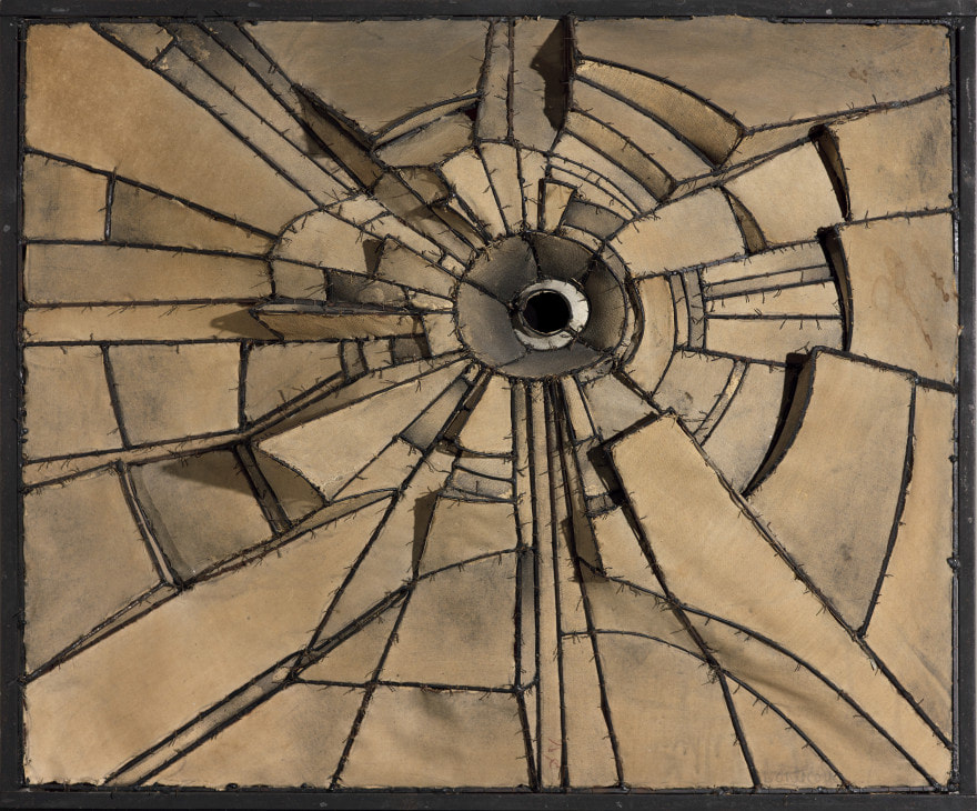
Title: Reflecting
Size: 2 ft by 2ft
Medium: Wood stained cardboard
Date of Completion: February 2024
Reflecting, inspired by Lee Bontecou, is a representational piece that resembles broken shards of the stars in the night sky. This piece attempts to represent the experience of reflecting on life when looking at the stars, and reflecting on the regrets we wish we could change. We must accept that we cannot change what is unreachable, such as our past or the stars.
Inspiration

|
|
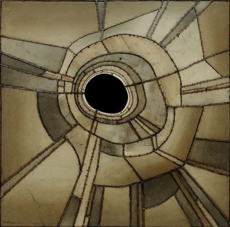
Untitled by Lee Bontecou
Lee Bontecou was an American artist born in Rhode Island in 1931. Lee Bontecous's work was influenced by the second World War and work of her parents which consisted of industrial engineering. Bontecou attended multiple art schools such as the Skowhegan School of Painting and Sculpture, The Arts Students League, which all influenced the medium and presentation of her wall reliefs. What influenced her work the most were the destructive effects of World War 2 and her attraction to outer space. She incorporated these themes into her work by creating reliefs and sculptures out of war materials, and eventually included at least one black circle in her work that was her way to express her interest in space. When I look at Lee Bontecou's work, I am drawn to look at the lines and contrast between the geometric shapes. In Untitled (top left) I immediately look at the dark circle in the middle of the piece because of how intense the contrast is. The rest of the shapes in the work are repetitive, but the circle in the middle is the only shape with its dark color. In my work I want to use the contrast between line, shape, and shadow and create a captivating performance.
Planning

I drew 7 sketches that all connected to my theme, coming of age. I wanted each one to represent some sort of relief that I would feel about that topic. So in each of my sketches I have one positive sub theme that would bring young adults relief about growing up, and I chose one element and principal of design for each. One of my sketches was a cactus with a couple of flowers on it. It's supposed to represent the idea that joy does not end at adulthood, because a lot of adults complain about how much work they have and how miserable they can feel. But while being an adult is hard, that does not mean there aren't reasons to stop being happy during adulthood. I was thinking that the cactus would represent the obvious hardships of adulthood, while the small flowers would be the pleasures. The element and principle of design would be texture and asymmetrical balance, because the cactus has spikes that add texture and because of the form of the cactus. My inspiration was Ann Weber because she constructed organic shapes out of cardboard and paper mache. I felt that this idea was confusing and did not contribute much to the aspect of "relief".

Another idea that I had would be to create a hand placing a puzzle piece on a globe that's created with more puzzle pieces. The idea of relief behind it was that when you grow up you get to contribute to society. My element and principle of design was color and unity, and although it is not on the paper, repetition. Again my inspiration was Ann Weber because of the 3 dimensional look. This idea was fine, but like the last sketch it did not bring me much relief to think that one of the positive aspects of growing up was going to be how you contribute to society. The idea of a puzzle piece fitting in with many more to complete a whole is more connected to the idea of functionality. And therefore the more I thought about it the less I liked the idea, because while finding the purpose of your life can be exciting to some people, to me it feels too philosophical.

The problem I had with the rest of my sketches is that I did not feel satisfied with how they represented relief. I had a concept that depicted that mistakes are part of life as a relief which I liked, but I did not like how it was represented. I searched online for other mediums of art that did not fall under the wall relief category, and began to question how I could turn those other mediums into a wall relief. A certain type of art that captured my attention was anamorphic, which is art created by distorted segments that create an image from a certain viewpoint. This idea mesmerized me, because it used space and unity to create an engaging showpiece. This is when I began to research Micheal Murphy and his work to put together an idea. The idea is that the structure, a rectangular piece of cardboard coming off the wall, will sustain more pieces of cardboard hanging by string to create two images from the front and side. The front side will look like broken glass, because to me that portrays the frustration of making mistakes. The other left and right sides will be semi-abstract representation of stars. I chose stars since they are associated with success, and success can derive from mistakes.
After some evaluation, I decided to change my project's presentation and slightly alter the meaning behind it. The biggest change was the format. Instead of creating anamorphic art, I would create an actual relief that would be easier to assemble and transport. And instead of having one star that also looked like broken glass, I would have multiple stars that resembled broken glass. The second change was the meaning. I still wanted to showcase the acceptance of mistakes but in a more personal manner. When I thought about stars, I thought about how much wonder how much time I spend looking at them when I get the chance to see them, and I realized how long I spend reflecting on my life when I look at the stars. When I reflect, I do think about my successes and joys, but inevitably I think about my mistakes and regrets as well (What broken glass represents in the background, the mistakes people see in their life). The older one gets, the more life they have to reflect on, and that is why I wanted to create multiple stars instead of just one. But just like the stars, the past is unreachable and we cannot change the nature of it, so we just have to accept it.
Process

I began by using a two foot by two foot long piece of cardboard and drew my design on it that I referenced from my sketchbook in pencil. Keeping in mind that the original format could change, I used soft strokes and drew very lightly. I drew a total of 5 'stars' were made up of 12 fragments at a minimum each. I drew four more small stars on the side. In each section I planned to cut out individual pieces of cardboard and glue them together onto the two by two board with diverting heights to make a relief. In total there were around 54 pieces that made up the fragments of the larger stars.

Once I finished drawing all of the pieces on the final board I wrote a number and letter for each section so that once I began cutting out the individual pieces, I could write the name and letter to help me remember which piece belonged where. I began naming the fragments of my first star/glass as A1, A2, and so on. The other stars/glass were named after a different letter and number such as B1, C1, D1, and so on. This made it easier to stay organized because all of the fragments are precisely drawn to create a sense of unity for each star, but many of them looked similar to one another. This system helped me not confuse where each fragment belongs because there were so many that I was going to cut out at once.

|

|
To cut out the pieces, I used other pieces of cardboard and traced the design of each fragment from the final board using a ruler. I measured how long each piece was on the final board in centimeters to be more precise, and then traced the measurements to the best of my ability onto a separate sheet of cardboard. I then took a blade and cut out the piece from the sheet of cardboard, twice, to eventually bind them together with strips of cardboard that were two centimeters wide. This was the most time consuming part of it all, as I had to not only cut the top part of the cardboard that was going to be presented, but also a copied piece that was going to be used as a base on the bottom to glue to the final board, as well as the many,many two inch wide strips of cardboard. 108 pieces of cardboard were cut out in total.

|

|

|
When I finished cutting out all of the necessary pieces, I started gluing them together with hot glue to create a 3D version of each, and I placed them in their numbered area on the board. I did not glue them to the board right away because I wanted to see how the layout would look now that the pieces were actually done. Naturally, the results were not exactly to scale with some of the pieces. Because some of them took up more space than planned, I got rid of some of the pieces that were too large and took up space and other pieces that would make the final piece look clustered. This change resulted in me adjusting the marked places of certain pieces that were rearranged to make the final look better.
Experimentation
I wanted to emphasize the aspect of contrast with my piece and add some color to my piece instead of leaving it bland with a single color. For this project, painting the cardboard with acrylic was not allowed, but using oils and wood stain to alter the hue of the cardboard was allowed.

|

|
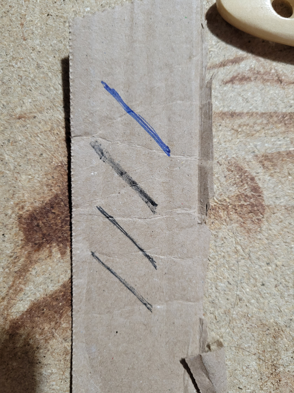
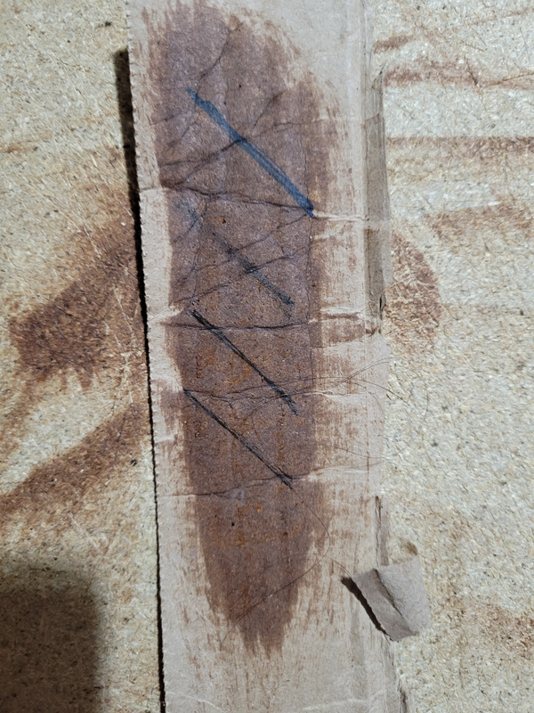
I got two shades of oil-based wood stain named "gunstock" (left can) and "kona" (right can). Using leftover cardboard, I experimented with the wood stain by seeing how the colors look. Gunstock and Kona were brushed with different amounts which changed the opacity and overall look of each trial. I really liked the look of Gunstock because it looked lighter while Kona looked too bold for the look I was going for. Gunstock had a richer look, and I wanted that quality to be in the foreground of the piece compared to the background where it could be overlooked. And since this piece is more representational, the dark Kona color could represent the darkness of the night sky.
|
|
Because I planned to use the darker woodstain shade, I wanted to test how dark it would get. The reason I did this was to see if it would cover up some marker strokes I did on the cardboard. I was going to number sections on the final board with marker to make them easier to see, but I wanted to stain the entire board as well. The black marker showed up well over the stain without being overpowered, but only if the stain was not opaque.
|
Process

I wanted the fragments to stand out from the solid-colored background. To do this, I thought it would be a good idea to add some contrast that was noticeable from the center of each fragment that accentuated the shape of each one whilst making the piece more interesting to look at. I did not color in the whole shape so that there would still be some light-colored contrast between the darker wood-stains. The stain color that was used for this was Gunstock. To create the inner-shape, I took a small rounded brush, dipped it into the Gunstock woodstain can, and free-handed each shape in a smaller size. I painted the inside of each shape one by one, and with the same brush no matter how big or small the fragment was. The size of the small brush made it easier to be more precise.
|

Once the first layer of wood stain had dried a second layer was added. The second layer did not cover the entire shape twice, but instead only covered the "outer" side of the shape which was facing away from the center of each star. I started off with a very stained brush and as I moved towards the other side of the shape I dried off the brush with a paper towel but still left a bit of stain on it. With the little amount of stain that was on the brush I "blended" the first and second layer to create an ombré effect. This created a richer look that made the fragments look complete.
|

After all of the fragments had been shaded in I laid the pieces out on the 2 by 2 foot piece of cardboard to get a sense of what the final product would look like. I then moved the pieces out of the way to mark all the numbers and letters on the board in marker. After that I took a 3-inch long brush and dipped it into the darker wood stain, Kona, and began to stain the big piece of cardboard. This process was tricky to get right because the biggest brush I had was still too small compared to the final board, and thus the first layer on stain had an uneven appearance, where darker blotches stood out because of the overlapping stain. To fix this I continued to brush the board with stain on the areas that were lighter to match the areas that were darker. I was running out of stain and to save it I did not completely stain the sections where the fragments were going to be glued. After I let all the stain dry I hot-glued the fragmented pieces according to their number and letter. Some pieces are placed differently to where they were before, because I did not create an outline of each piece with marker because that would easily be seen even if the piece was glued in the correct spot.

My last step was to create the broken-glass effect on the background. To do this I dipped the small brush into the Kona can further down, which still had a pile of the dark, unmixed stain, and simply just drew a broken glass looking design on the background. This step was one of the more frustrating ones because I had already glued the pieces to the board and could not move them to add more detail to the design. Sometimes when drawing I would accidentally hit the side of one of the fragments and create a crooked, messy line that was not the intention and it was obvious, so I had to make the line thicker to make it appear straighter. At first when I was drawing the lines I regretted it because they were, in my opinion, too dark and created too heavy of a contrast in the whole piece. But after I finished drawing all of them I accepted that the shadows created from the fragments would eventually provide a cover for the lines and it would complete the piece.
Critique
|

|
|
The similarities between Lee Bontecou's work and mine are the use of contrast and light. The contrast, although used differently, is inescapable and is what makes the viewer's eyes move throughout the piece. It is the first and most noticeable element of design in both works. The contrast in both works is created by the differentiating values and shades of brown, as well as the harsh and obvious dark lines that move in towards a specific point. The lighting highlights the contrast even further by making temporary shadows that can be manipulated at any moment to change the overall look of the pieces. The placement of the lighting plays a critical role in the effect the works have, because they dramatize the pieces and change the focal points depending on the placement.
Some differences between Lee Bontecou's work and mine are the amount of focal points and the space created in the work. Lee Bontecou creates an obvious focal point the viewer immediately sees because it is singular and often the darkest part of the piece. In my work, however, I have five stars and therefore five focal points, which were created to make the viewer's eyes move at the center of each star. Bontecou's focal points were also much larger than mine, because mine are all connected by lines thinner than what Bontecou produced. In Bontecou's work there is almost no negative space without lines or different hues, but in mine, there are a couple of areas that are just negative space in between the subject. The last major difference is the diversity of shape. For the sake of the message I wanted to convey, I used repetitive shapes that together look like broken stars, while Lee Bontecou used triangles, rectangles, circles, and more organic shapes to make her art.
Some differences between Lee Bontecou's work and mine are the amount of focal points and the space created in the work. Lee Bontecou creates an obvious focal point the viewer immediately sees because it is singular and often the darkest part of the piece. In my work, however, I have five stars and therefore five focal points, which were created to make the viewer's eyes move at the center of each star. Bontecou's focal points were also much larger than mine, because mine are all connected by lines thinner than what Bontecou produced. In Bontecou's work there is almost no negative space without lines or different hues, but in mine, there are a couple of areas that are just negative space in between the subject. The last major difference is the diversity of shape. For the sake of the message I wanted to convey, I used repetitive shapes that together look like broken stars, while Lee Bontecou used triangles, rectangles, circles, and more organic shapes to make her art.
Reflection
All in all, I feel very satisfied with the final result. This project turned out better than I had imagined in the first place, and it was very rewarding to see the final result placed in a professional location after all my work. I would say that working with cardboard and wood stain has expanded upon my art skills since I have never worked with either of those materials before, and to create something that I am proud of is valuable to me. The greatest challenge I encountered was placing my ideas onto a single piece in a coherent way that made sense not only to me but to others as well. But the greatest challenge craftsmanship-wise was building the fragments in a way that was stable and beautiful, especially because the process took so long. The most enjoyable part of this process was shading the fragments with woodstain, because it was just like painting but lighter and faster. In conclusion I hope others can look at my work and be captivated by the hues and contrast, I want them to look at it for a while, just like they would look at real stars in the nightsky.
ACT
Clearly explain how you are able to identify the cause effect relationship between your inspiration and its effect on your artwork?
The constant use of contrast and lighting inspired the approach I took for my piece
What is the overall approach the author has regarding the topic of your inspiration?
It is amazing what people can create out of unusual materials
- What kind of generalizations and conclusions have you discovered about people, ideas, culture, etc. while you researched your inspiration?
People can create art out of unusual materials that seem reserved for other tasks.
What is the central idea or theme around your inspirational research?.
The idea was to research people who worked with cardboard or a similar looking material
What kind of inferences did you make while reading your research?
Art can be created out of objects that created an experience as well as materials that influence life.
Bibliography:
“Lee Bontecou.” The Art Story, 2016, www.theartstory.org/artist/bontecou-lee/.
“Lee Bontecou.” Kunstmuseum Den Haag, 20 Jan. 2017, www.kunstmuseum.nl/en/exhibitions/lee-bontecou. Accessed 27 Feb. 2024.
“Untitled, 1959 - Lee Bontecou - WikiArt.org.” Www.wikiart.org, www.wikiart.org/en/lee-bontecou/untitled-1959. Accessed 27 Feb. 2024.
