
|
Title: Self Portrait
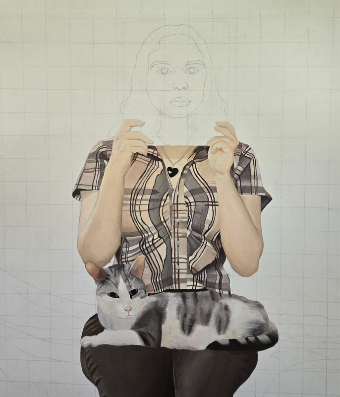
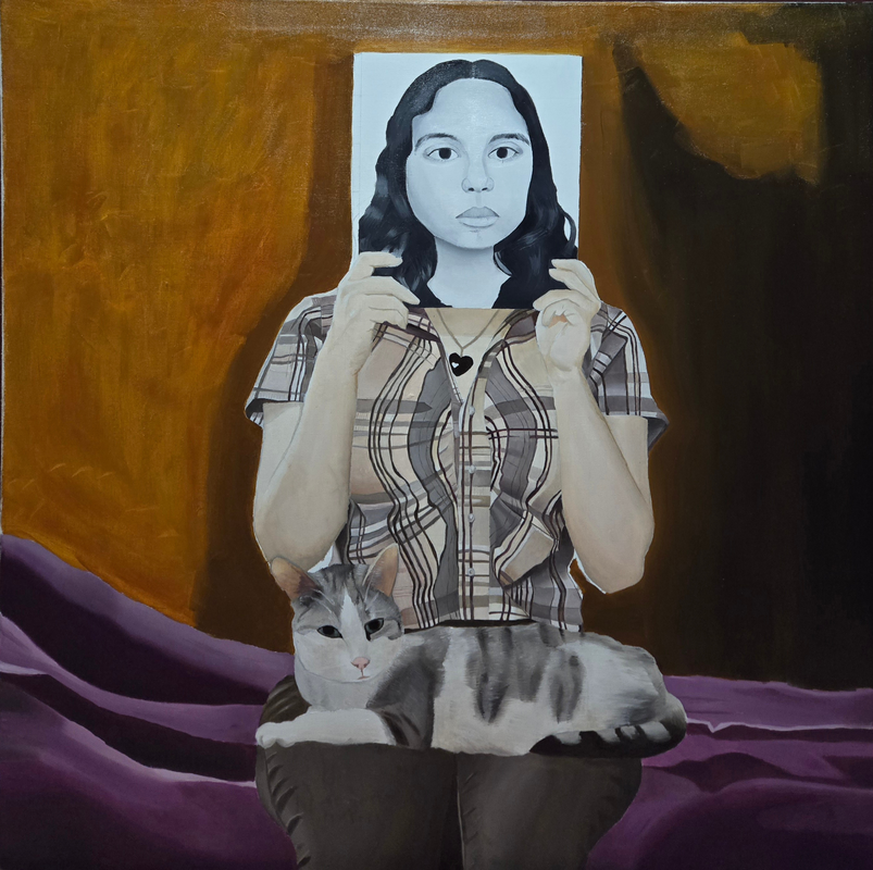
Size: 36 in x 36 in Medium: Oil paint Completion: April 2024 Inspired by Norman Rockwell's "Girl Reading a Post" my self portrait is a representation of how I think other people see me, somber like the face on the cover of a magazine, versus how I see myself, separate from that image. This painting shows how people can be perceived in total contrast to how they perceive themselves. |
Inspiration

Cover Girl (Girl Reading Post) 1941 by Norman Rockwell
Norman Rockwell was born in 1894, in New York, USA. From an early age Rockwell knew that he wanted to be an artist. He attended the National Academy of Design and the Art Students League of New York starting at the age of 16, and he pursued a career as an illustrator for magazines for most of his life. Rockwell created many illustrations for magazines such as LOOK and The Saturday Evening Post, and constantly illustrated themes of daily American life. His illustrations often depicted amusing scenarios which charmed the public and made him exceedingly popular. He created 321 illustrations for The Saturday Evening Post that had themes of innocence, childhood to adulthood, patriotism, and idealized life. The era in which he gained the most popularity and success was during the nineteen thirties to the nineteen forties, a time when magazines were the most common source for news, advice, and advertisement. Many critics disapproved of Rockwell's daily American life artwork because according to them it had little to no real value. His later work included themes of racial injustice and social commentary which are now celebrated by many.
What I like about "Cover Girl (Girl reading the Post) 1941" is the way the magazine is used to hide the face of the girl, yet, the cover of the magazine features a woman's face which takes the place of the girl's face. The artwork is supposed to show a schoolgirl who will soon begin her transition to adulthood. The girl's face is replaced by an older woman's face on the magazine cover to show that eventually the girl will become a woman. Additionally, the white background of the magazine matches the white background of the smaller magazine, which makes the illusion all the more genius. I want to recreate this by placing myself as both the woman and the schoolgirl for my self portrait.
What I like about "Cover Girl (Girl reading the Post) 1941" is the way the magazine is used to hide the face of the girl, yet, the cover of the magazine features a woman's face which takes the place of the girl's face. The artwork is supposed to show a schoolgirl who will soon begin her transition to adulthood. The girl's face is replaced by an older woman's face on the magazine cover to show that eventually the girl will become a woman. Additionally, the white background of the magazine matches the white background of the smaller magazine, which makes the illusion all the more genius. I want to recreate this by placing myself as both the woman and the schoolgirl for my self portrait.
Planning
For my self portrait, I did not want to recreate the original message that Norman Rockwell's Girl Reading the Post has. The point of Girl Reading the Post is to show how a young girl will eventually become a woman. I, however, want to focus on how I see myself versus how I think others see me. The cover of the magazine in my self portrait will show how I present myself in public. Everything else that is not in the magazine is going to include things from my life outside of school. To connect back to my theme "coming of age", this painting can show how certain people have contrasting public and private images of themselves.

|

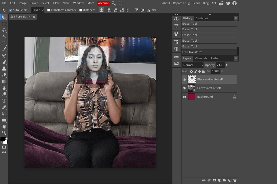
To begin planning I took reference photos of myself that I planned to merge together to create one final reference for my portrait. The image on the left is the picture that is going to be used for the magazine cover. I wanted to make myself look somber, and to further emphasize this, I changed the photo that I took to gray scale, and made the picture black and white. This is going to represent how I look in public. It contrasts the rest of the portrait, which is going to be me sitting on a blanket with clothes I don't wear to school, surrounded by things I own at home. This is going to represent how I see myself.
|

|
|
To make a reference for my self portrait, I used Photopea, an online photo editor that works like Photoshop. I made a 36 by 36 inch canvas (3 feet by 3 feet) and inserted the photo of me sitting in the living room. I enlarged it because the original size of the photo made the magazine look too small, which was a problem because it is the focus of my portrait. After I enlarged it to a decent size, I inserted the black and white reference photo and placed it over the magazine with 73% opacity so I could tell if it was covered up correctly. I kept the image at 70% opacity for most of the process because placing the photo over the magazine was the longest part of the process. At first it would either be too big, or too small, and too crooked, but after rotating with and cropping it with the rectangle tool, I found a place where I thought the image matched the rest of the background fairly well.
|
|
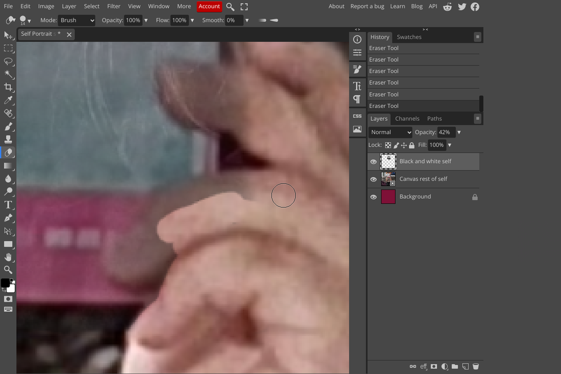
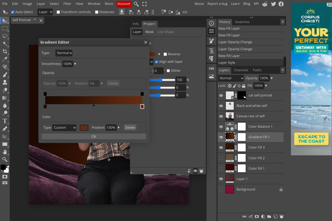
After that I used the eraser tool to erase the parts of the cover that were covering up my hands, and the background of my living room as well. I only wanted me, and the covers of my bed from the picture. I chose to sit on the blanket from my bed because that is where I am the most comfortable in my house. After I erased the background I added a gradient fill to the background to add some dynamic color. I did not want the background to be white or even grey-white gradient because it would look too similar to the magazine cover, which would reduce the impact of contrast that it's supposed to have. Instead, I opted for a maroon and brown combination for the background, because I believe they compliment the rest of the colors, and because those colors are very cozy to me, which is what the portrait represents.

The last thing that I added was my cat on my lap. I wanted to show how comfortable I feel at home, so I replaced the books that the original girl in Rockwell's "Girl Reading the Post" has with my cat instead. I did this because after a stressful day when I get home my cat is waiting, looking at the window, and he greets me every time I get there. He likes to sit next to me while I work which always puts a smile on my face.
Process

Before planning the actual portrait, we were required to build our own 3 by 3 foot canvas. First, four wooden pieces that made up the frame were connected. Next I cut out a large section of cotton fabric that was larger than the frame. This allowed me to fold the extra layer of fabric on top of the frames in the back, to make a sturdy canvas. As I folded the extra layers on the frame one by one, I used a staple gun to staple the fabric and keep it in place before stapling the next layer. After all the sides were stapled, the corners were stapled to make sure that the fabric would not be loose. Then I used scissors to cut off the remaining loose fabric in the back. The last step of this process was to add gesso primer onto the front of the canvas to tighten it, as the fabric was a little loose towards the center of the canvas. This would also make the canvas smoother and easier to work with. I used a medium-sized brush to spread the gesso throughout the canvas, first spreading it vertically. After it dried a couple of hours later, I spread the gesso with horizontal strokes. Then I let it dry for 24 hours before using it.
Experimentation

|

After making the canvas I ran into a problem. The canvas began to warp and bend unevenly on the right side in the front. The frame was sticking out and it messed up the evenness of the canvas. This prevented me from starting my self portrait. One solution that I tried was to add gesso primer to the back of the canvas where the wood was bending, to tighten it so that it could possibly be tightened enough to go back to being even. This solution, however did absolutely nothing but strengthen the back of the canvas.
|

|

The second solution that I tried was to add weight to the area that was bending unevenly. I grabbed a load of books and placed a stack of 8 books on top of the weird corner. Placing that many books seems excessive, but I hoped it would be enough weight to flatten the corner. I also placed a couple of other books on the other three corners so that the canvas would lay completely flat on the floor. After that I waited 24 hours to see if it was a success. It was not even close to even.
|

The last thing I tried to make the canvas even was to drill L-brackets onto all four corners of the back of the frame while laying it on the floor. This was the best attempt at flattening the canvas out of everything else that I tried. It was not perfect but the difference is very noticeable, and it was successful. After I finally got the canvas to be flat, I was confident that I could make an accurate replica of the reference photo.
Process

|

|
I started by making marks all around the edges of the canvas. I made small marks 2 inches apart because I felt that 1 inch marks would be too crowded, and would leave a lot of pencil marks that would be hard to cover up with the paint, and 3 inch marks were too far apart to the point that it would be hard to replicate the reference photo. I connected the lines that were across each other vertically and horizontally. Some lines were a bit off so I had to re-draw them towards the end of the frame.

|

|

|
I drew the background first, which was just a couple of lines that made up the blanket. After that I drew from the bottom, up, so I drew my pants, cat, shirt, and face in that order. I drew the entire outline first and focused on the details after I completed the outline. I drew everything square by square constantly referring to the photo that I photoshoped. After I drew the outline I focused on details such as fur patterns, facial features, and shadows in the blanket. I did not outline the shadows anywhere, I thought it was unnecessary and would become too confusing.

`The last detail that I added to the final drawing was the pattern on the shirt. This was the most difficult thing to draw because the pattern would have many overlapping lines, shadows, and highlights that I took time to draw in, so that it would be as accurate to the reference as possible. When the drawing was complete, there were many smudges from the pencil on the white canvas, and that bothered me so I went back and erased all of the grey smudges.
Experimentation

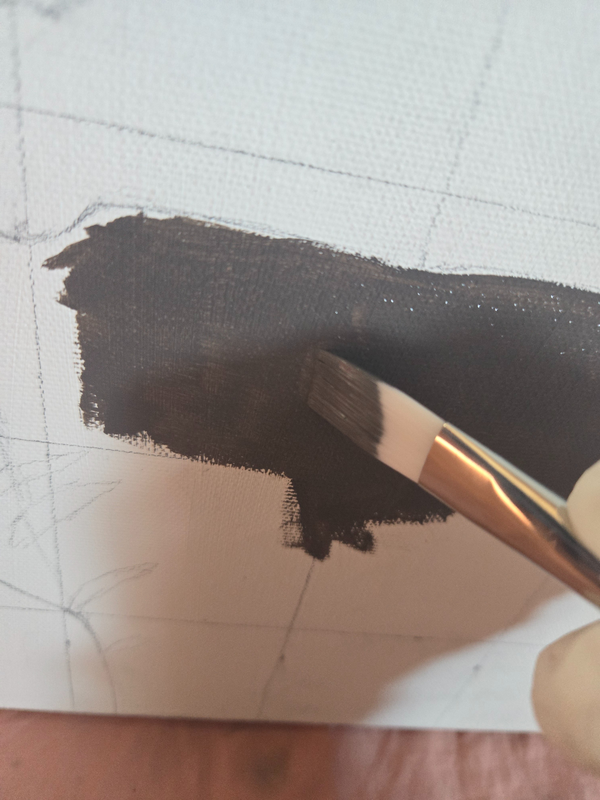
This was my first oil painting ever and I was both scared and excited to make an entire 3 ft by ft painting with a medium that I had never tried. I bought a set of oil paints that included many colors that I thought I would need to complete my painting. I knew that I wanted to start painting the subject before I painted the background because of my previous experience where I accidentally painted over the guide of the subject because I focused on the background (illustration). To begin I knew I wanted to start painting the pants, since that had a limited color palette. I simply used black and white to make a light grey, and I began painting straight away on the canvas without testing anything first.
|

|
I started by painting the middle of a section so that I would be able to blend it darker or lighter. The paint was not as smooth as acrylic and that made it harder to spread evenly on the canvas. I made the section of the right darker, and began to move my brush towards the middle so that I could blend the two shades, and to my surprise it blended very easily. Almost too easily because then one section became darker than I wanted it too so I had to add white to make it the shade it was the first time. This process was very messy because I was not used to using oils so it was hard to get used to them. As you can see from the picture on the left to the picture on the right, I ended up covering certain 'lights and shadow' outlines that I intended to leave white and paint over them later. This happened because I kept trying to make the blending process smoother and more natural looking so I accidentally covered the outlines up. I didn't realize it then but now I know that it was frustrating to blend because I was pressing too hard down, so the paint would drag, blend, but leave a thin layer of paint.

This was the result of me trying my best to blend oils. I had mixed feelings during this stage, because I liked how easily the oils blended but at the same time (in my opinion) the result looked off. I kept moving on because I knew that I could go back and add details later
Process

The next thing I painted was my cat. This was obviously more difficult to do because he had so many overlapping shades of white, grey, and black that I wanted to recreate perfectly. First I painted certain areas dark grey and left other areas white, to get an overall sense of where the colors would go. I struggled to recreate the fur for a while, because I was using a small brush to make individual strokes, but once I began to use a fan brush with a mix of colors, everything began to look more natural as it resembled real fur. This process took a lot of time because I kept adding layers of black and white until I was satisfied with how the fur looked. Painting the ears was also a challenge because I was working with color and not just black and white, so I made a light pink mixing red and white, plus orange with yellow to make the ears. This is the stage where I learned that by just barely touching the paint on canvas I could achieve a smoother blend that did not lift the paint off. The last thing I painted on my cat were his green eyes.
|


|

|

|

|
The next thing I painted was my shirt. As you can see throughout the progression of the images above, I painted the shirt from left to right, because I'm right handed and didn't want to accidentally lean my arm on the painted shirt. This process was also lengthy because I painted each and every individual box--not just on the grid but also on the shirt--a unique color to create the most accurate shading and color matching possible. To paint the shirt, I mixed colors of red, peach, white, and sometimes leftover grey. The grayer areas during this stage were on the top left of the shirt (shoulder) and bottom left because that is how the lighting affected the colors. As I made my way over to the right, the colors became more peach/pink, and I had to mix colors constantly to get the right shade for each. Whenever I painted a pink-peach color I would clean my brush, add either more orange, peach, or white, (many times directly onto the canvas) and make a noticeable gradation on the shirt to indicate shadows. After I painted a section with the right colors I would mix red and black to create a dark shade that almost looked brown, and I would paint over the leftover white lines to make the darker vertical lines of the shirt. This is mostly noticeable from the second image to the third image above.

|

|
Having drawn all those lines with pencil at the very beginning was very helpful, because when I looked at my reference I would notice that sometimes I would almost miss a color or would almost overlap them in the wrong sections. As I kept progressing to the right, I noticed that it looked different from the left, but I didn't know exactly why. I noticed that the right side lacked the depth that the felt side had, and as I progressed I remembered to incorporate shadows so that there would be more unity in the piece.

|

|
I also emphasized the gradient between hues of colors to again, add depth and realism. The picture on the left is an example of two shades of brown being added to a specific rectangle shape on my shirt, and the picture on the right (after adding more white) shows how the colors have been blended to highlight the shadows.

|

|
To finish the shirt I used a lot of grey-brown colors because of how the lighting affected the picture. The picture on the left shows how I progress from left to right, focusing on making accurate gradations in each rectangle before adding the darker lines to complete the section.
Experimentation

This was one of the trickiest parts of the process because I kept remaking the skin color over and over to get a shade that matched the photo. There are a lot of different shades on the arms because of the lighting from the original photo is very dramatic, and it was hard to create a shade that close enough to the reference. I started out with the left arm on the portrait because that had the lightest shade, which is easier to re-create in my opinion. I did this by mixing some red, white, and yellow ocher.

|

|
Painting the arms was tricky because there were many shades in the reference photo that were hard to recreate accurately. I started with the lighter colors and then incorporated the darker colors that were closer to the elbows. Blending them was also tricky because I had not done much blending on a large scale since the pants.
|
|
Painting the collarbone and the necklace was easy. I used the same colors as the arms, but the skin on the collarbone is lighter than the arms, and then the shadow from the magazine creates harsh contrast. The shadow of the collarbone was too orange at first which made it look like I had sunburn, but after adding some light brown to the canvas where the orange was, it appeared more natural. I used that same brown but added a bit of black to make the necklace chain. Then I used straight black and with a small brush I carefully painted inside the guide of the heart-shaped necklace.
|

|
|

|

|
Making the face also involved lots of experimentation because I did not want to mess up. Although I worked with only two colors, black and white, There were many variegating gradating shades. I started off very lightly because I knew that it would be harder to make something lighter compared to making something darker. I made the grey shades on the whole face and focused on the features like the eyes, mouth, and eyebrows last. I added the dark grey in the eyes, moth, nostrils, and eyebrows last as a guide to see how I could make the rest of the face more accurate.

|

|
The details such as the eyelashes and eyebrows were very small and I did not use the other brushes to make them. I used the smallest brush that I had, coated the tip with a somewhat thick layer of black paint and very precisely made two lines along the edges of the eyes that were the eyelashes. I also used this brush to darken areas in the mouth and eyebrows. During this stage it was crucial that I stayed focused otherwise I would ruin the lashes. This took a lot of self-control and concentration because my hands are shaky when I have to add details.
|
Process

|

|

|
To do the hair I used the same grey that I used for the face and added it to sections of the hair which I saw were lighter than others. Then I straight up used black and painted around the grey areas, just to get a sense of how everything was going to look like. To blend the two colors I used a flat brush and started with the grey area, and pushed it towards the black areas. If the grey area become too dominant, then I would clean the brush and push the black into the grey, this process happened multiple times until I was satisfied with the result.
|
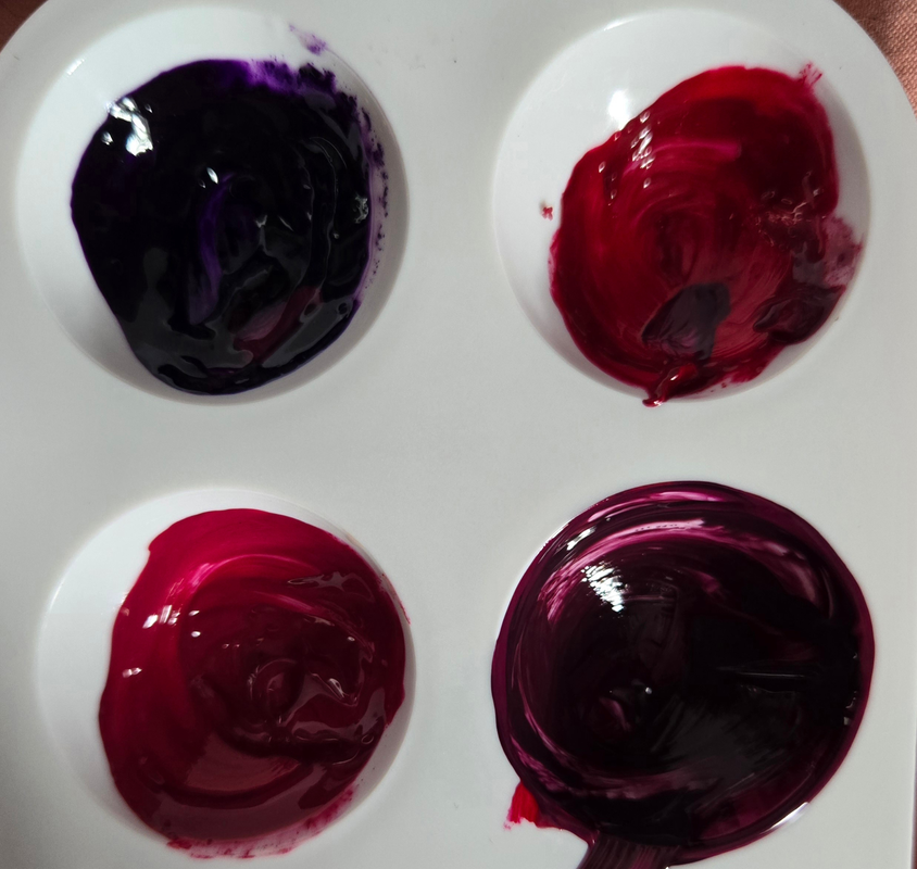
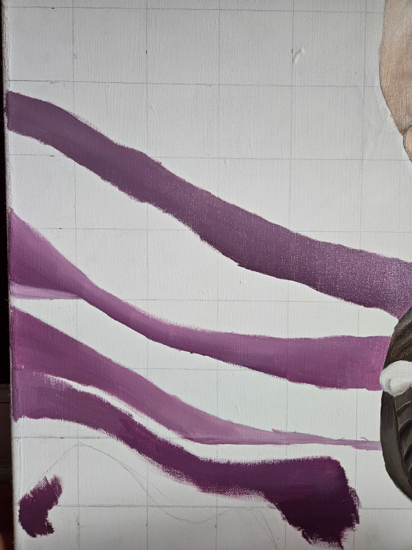
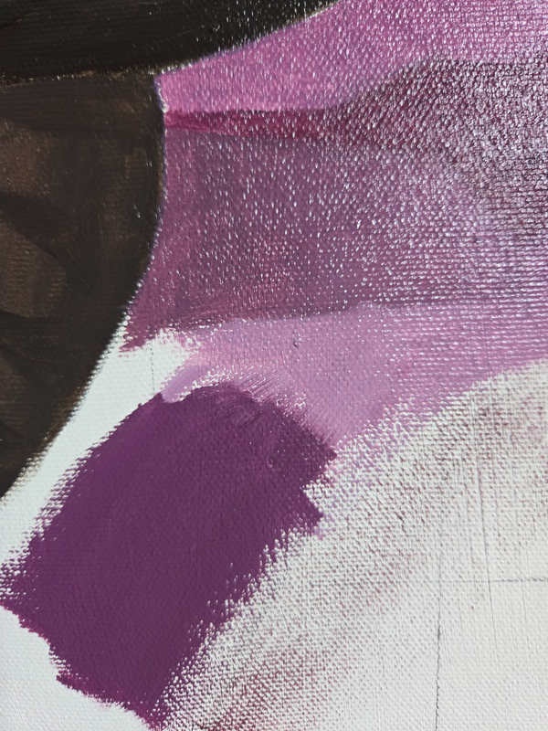
The picture on the left shows how I mixed red and purple (with some black) to make the purple color of the blanket in the background. There was no particular order in which I placed the colors, because I went back and forth between adding darker and lighter shades, blending as I placed on canvas.
|
|
|

This is how the blanket turned out. I have mixed feelings about this because it matches the photo fairly well but on its own it is hard to tell that it is a blanket.
|
|

|

|
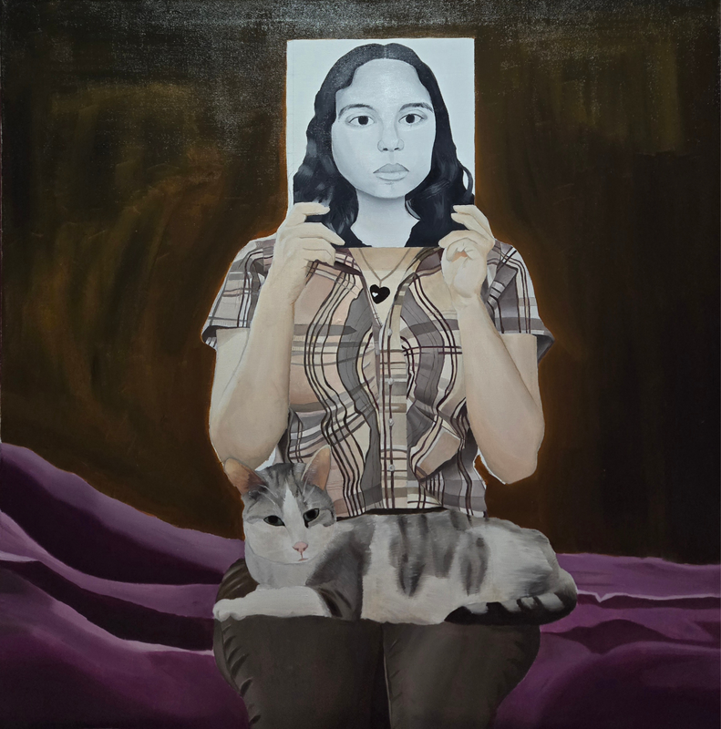
The last step was to finish the background. I started by making it exactly like the reference photo, but I didn't like the look of it, so I decided to paint it a yellow-red color and layer black on top of it. The picture on the left shows me adding a think layer of red and yellow paint. It is not even because then I started covering it up with black with a medium sized brush (middle image). The layering was uneven so I used a bigger brush to add yet another layer of black paint, and that was how I finished the background.
Critique

|
|
Similarities between Rockwell's piece and my piece is the set up. Both girl reading the post and I are holding up a magazine that alters the way the face looks. The same pose is used to align the body with a different face and the background is relatively simple.
Differences include the different objects used. Girl reading the post has books on her lap while I have a cat. Another difference is the color schemes. The magazine in Rockwell's piece has color but mine is in black and white. The background in Rockwell's piece is also lighter and has a title, but mine is dark and has no words in it.
Differences include the different objects used. Girl reading the post has books on her lap while I have a cat. Another difference is the color schemes. The magazine in Rockwell's piece has color but mine is in black and white. The background in Rockwell's piece is also lighter and has a title, but mine is dark and has no words in it.
Reflection
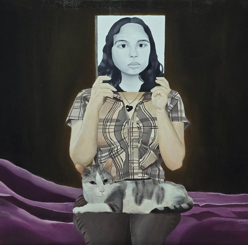
I feel conflicted with this piece. I like the foreground, especially the cat and the shirt, as those were my favorite parts to paint since they were so complex, but I really dislike the background. The colors do not match the reference picture that well, although changing the background was intentional, I regret changing it because it does not compliment the other colors. The blanket is too purple and distracting, and I feel like I could have used more grey on the face to make it more detailed. I gained a lot of new experience and skills while doing this project because it was my first time using oil paint.
Check list
ACT
Clearly explain how you are able to identify the cause effect relationship between your inspiration and its effect on your artwork?
the way the girl covered her face on the magazine inspired me to make my own version of that
What is the overall approach the author has regarding the topic of your inspiration?
Norman Rockwell was very important as he painted the lives of Americans
What kind of generalizations and conclusions have you discovered about people, ideas, culture, etc. while you researched your inspiration?
Depicting daily life can tell us a lot about an era
What is the central idea or theme around your inspirational research?
Growing up and how our physical appearance changes
What kind of inferences did you make while reading your research?
Facial expressions make a difference in how a painting is interpreted
“Cover Girl (Girl Reading the Post), 1941 by Norman Rockwell - Paper Print - Norman Rockwell Museum Custom Prints - Custom Prints and Framing from the Norman Rockwell Museum.” Norman Rockwell Museum Custom Prints, prints.nrm.org/detail/260919/rockwell-cover-girl-girl-reading-the-post-1941. Accessed 16 Mar. 2024.
“Norman Rockwell - Paintings, Museum & Ruby Bridges.” Biography, 1 Dec. 2021, www.biography.com/artists/norman-rockwell.
“Norman Rockwell - Paintings, Museum & Ruby Bridges.” Biography, 1 Dec. 2021, www.biography.com/artists/norman-rockwell.
